Monica Ortiz Feminist sex therapist
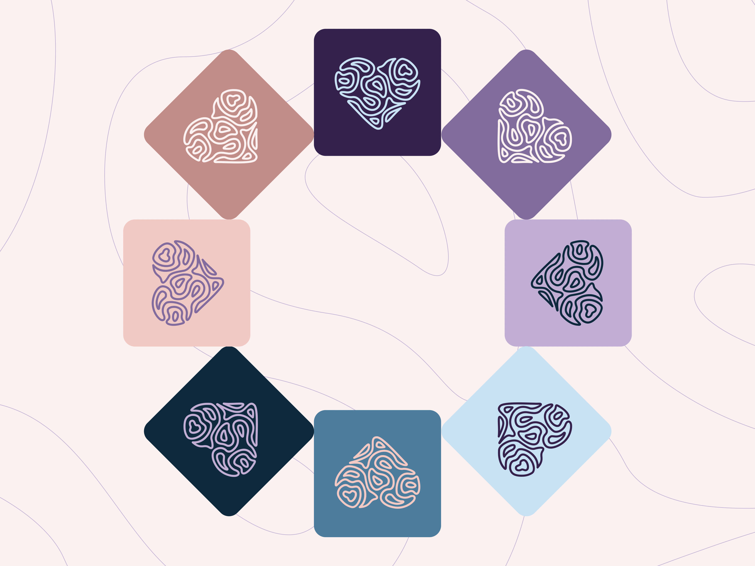
Thinking Emotions: A heart with a brain's texture
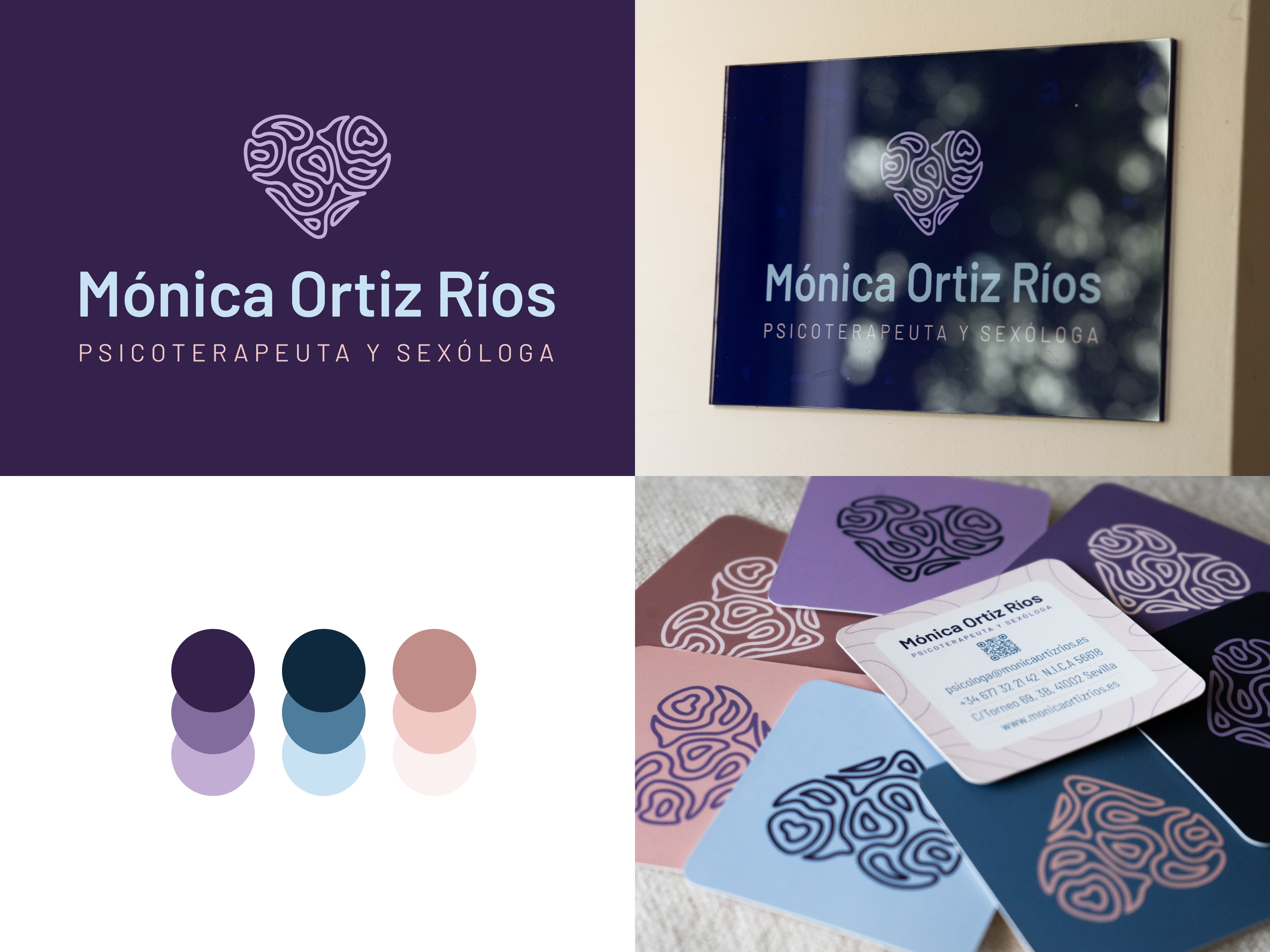
This project involved crafting a complete visual identity and premium business cards for a leading feminist sexologist and psychologist. The branding challenge was to blend clinical authority with approachable warmth, directly addressing the intersections of sexual health, emotion, and mental well-being within a supportive, feminist framework. This design mimics the texture of a human brain, visually unifying the thinking process with emotional experience. The continuous-line approach also serves as a dual metaphor, representing both a labyrinth of self-exploration and a safe harbor or island. The color palette combines deep, professional cold tones with a warm, soft touch of pastel pink. The final touch of sensory empathy is achieved with a high-end, tactile soft-touch finish on the business cards.
Next case study